


They are always looking for ways to make their properties more visible, improve how people see...
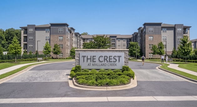
First impressions happen before a prospective resident ever steps inside a leasing office. They happen at the curb, where a monument sign either signals a well-run, design-forward community or blends into the background like every other property on the block. In 2026, apartment signage isn’t just a way to display an address but a serious differentiator in a crowded multifamily market and a tool for branding, navigation, safety, and overall resident experience.
Modern apartment signage does more than simply tell people where they are. It impacts the way residents and visitors experience a property, it reinforces the identity of a community at every touchpoint, and it conveys professionalism and care. Property owners and management companies are increasingly treating signage as an integrated system rather than a collection of individual signs ordered piecemeal over the years.
This article walks through the major signage trends shaping apartment communities in 2026, ten practical design ideas you can apply across a property, material comparisons, best practices, common mistakes, and a step-by-step approach to planning a complete signage system.
What Is Modern Apartment Signage?
Apartment signage is the complete set of signs within a multifamily community used to identify, direct, inform, and brand the community. A single entrance sign is not a signage system; a true system is a coordinated set of signs that share a consistent design language and work together to guide people from the street to their front door.
Key signage categories include:
- Property entrance signs: The first visual statement of the community, usually monument or pylon signs at the main gateway
- Building identification signage: numbers or names on individual buildings within a multi-building property
- Wayfinding signs: Directional signs to navigate residents and visitors around the property
- Parking signs: Reserved parking, visitor parking, garage levels, traffic flow
- Amenities signs: pool & fitness center, clubhouse, dog park, etc.
- Directory signs: such as maps or listings of where buildings and units are located
- Leasing Office Signs: The sign that tells prospective residents where to go first
- Safety and regulatory signs: fire lanes, ADA-required signage, emergency exits, and code-mandated postings
Top Apartment Signage Trends for 2026
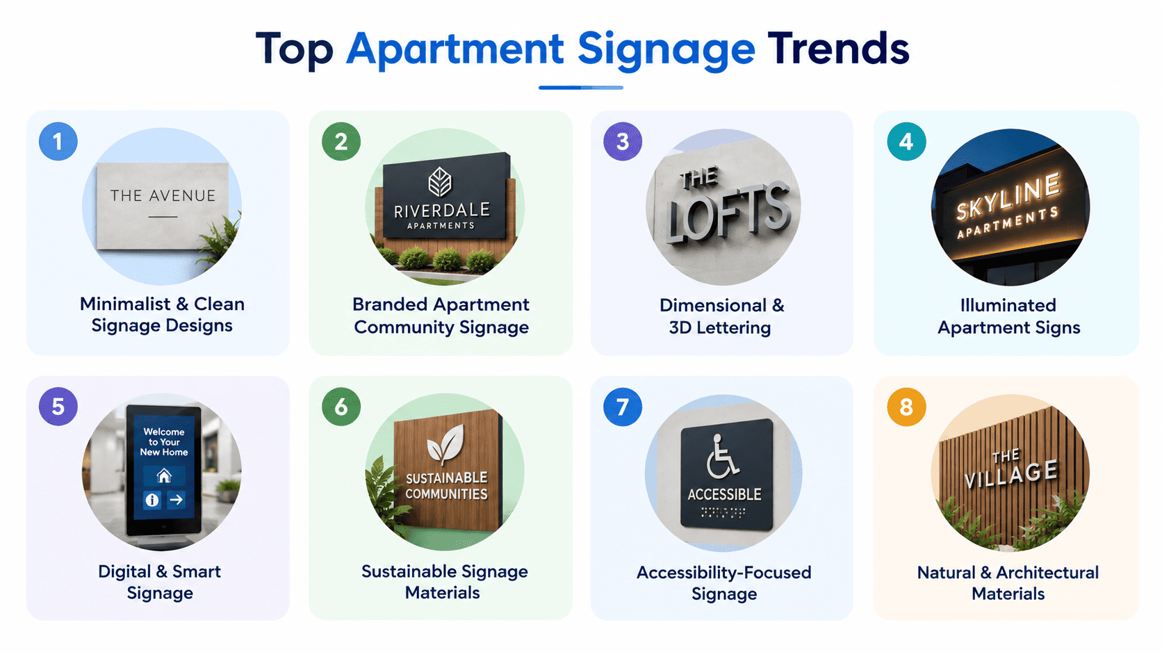
1. Minimalist & Clean Signage Designs
Minimalism still reigns in multifamily signage design. Signs feel modern without trying too hard, thanks to simple typography, lots of white space, and limited color palettes. This works well on modern architecture with clean lines, glass, and neutral exterior palettes. A busy or ornate sign does not match the design language of a building, while a minimalist sign will.
2. Branded Apartment Community Signage
Signs are increasingly viewed as an extension of a property’s reputation. That means consistent use of logos, color palettes, and typography on every sign on the property, from the entrance monument to the pool gate. The approach of Sunrise Signs to branded workspaces is similar to that of corporate interiors but tailored to multiline properties: When exterior and interior signage are unified in the same visual language, residents and prospects perceive the community as more polished and intentional, and the brand becomes more memorable.
3. Dimensional & 3D Lettering
Raised or dimensional lettering, individual channel letters, laser-cut metal, or thick dimensional letters mounted with standoffs add depth and a premium feel to entrance signs, building identification, and lobby walls. Dimensional lettering tends to work best where it will be viewed up close or where a sign needs to read as a statement piece, such as a leasing office entrance or a monument sign.
4. Illuminated Apartment Signs
As more prospective residents tour properties in the evening, illuminated signage has become close to a necessity rather than an upgrade. Popular approaches include:
- Backlit lettering, where light shines through the face of the letters
- Halo illumination, where light glows around the edges of dimensional letters against the wall
- LED monument and entrance signs, which improve visibility and safety after dark while giving the property a modern, high-end look
5. Digital & Smart Signage
Larger communities are trying out digital directories, electronic message boards, and interactive wayfinding kiosks. That means property managers can update information on events, availability, and alerts without reprinting physical signage. It also serves as a guide for larger campuses with many buildings and facilities.
6. Sustainable Signage Materials
Sustainability is making its mark in material selection: recycled and recyclable substrates, durable materials chosen to reduce replacement frequency, and low-energy LED illumination in place of older lighting technology. The goal is to marry environmental responsibility with durability and the appearance of a property. But also consider the cost, as well as the lifespan of apartment signs before they need to be replaced.
7. Accessibility-Focused Signage
Accessibility is now a key consideration in sign planning, rather than an afterthought. This means clear typography and strong contrast for readability, Braille and tactile lettering where required, and accessible identification for rooms and facilities. Designing ADA signs for a wider array of residents and visitors is not only good practice but also often a compliance necessity.
8. Natural & Architectural Materials
Wood-inspired finishes, metal, and stone or stone-look materials are being used to tie signage more closely to a building's architecture and surrounding landscaping. Products like Di-Noc architectural finishes can even replicate natural textures on durable substrates, giving signage the warmth of wood or stone without the maintenance burden, especially effective at entrances where signage and landscaping are planned together.
10 Modern Apartment Signage Ideas
Idea 1: Statement Monument Entrance Sign
-
Where to use it: Main property entrance
-
Materials: Stone or stone-look base with dimensional metal or acrylic lettering
-
Design style: Bold but clean, often illuminated
-
Branding opportunity: High; this is the primary brand touchpoint.
-
Practical notes: Needs to be legible from the road at driving speed; a pylon sign is a strong alternative on high-traffic roads where extra height improves visibility
Idea 2: Modern Building Identification Signs
-
Where to use it: Exterior of each building in multi-building communities
-
Materials: Aluminum or dimensional acrylic numerals
-
Design style: Minimalist, consistent across all buildings
-
Branding opportunity: Moderate
-
Practical notes: Must be visible from both vehicle and pedestrian pathways
Idea 3: Elegant Lobby Directory
- Where to use it: Building lobbies or leasing office
- Materials: Acrylic, metal, or digital display
- Design style: Refined, often paired with dimensional logo elements
- Branding opportunity: High
- Practical notes: Needs to be easy to update as units or tenants change
Idea 4: Branded Wayfinding System
- Where to use it: Throughout the property at decision points
- Materials: Aluminum posts and panels, or PVC for budget-conscious builds
- Design style: Consistent iconography and color-coding
- Branding opportunity: High
- Practical notes: Requires a full property audit to place correctly
Idea 5: Illuminated Address & Building Signs
- Where to use it: Building exteriors, especially where nighttime visibility matters
- Materials: Halo-lit or backlit dimensional letters
- Design style: Modern, high-contrast
- Branding opportunity: Moderate
- Practical notes: Factor in electrical access and maintenance
Idea 6: Amenity-Specific Signs
-
Where to use it: Pool, fitness center, clubhouse, dog park
-
Materials: Weather-resistant materials for outdoor amenities
-
Design style: Playful but on-brand, similar in spirit to the mission statement and wall signage used in shared community spaces
-
Branding opportunity: Moderate
-
Practical notes: Should include relevant rules or hours where applicable
Idea 7: Modern Parking & Garage Signs
- Where to use it: Surface lots and parking structures
- Materials: Aluminum, reflective for garages
- Design style: Clear, high-contrast, code-compliant
- Branding opportunity: Low
- Practical notes: Must meet local traffic and accessibility regulations
Idea 8: Minimalist Pool & Fitness Center Signs
- Where to use it: Entrances to shared amenity spaces
- Materials: Acrylic or metal
- Design style: Clean typography, minimal ornamentation
- Branding opportunity: Moderate
- Practical notes: Often needs posted rules alongside branding
Idea 9: Dimensional Logo Wall
- Where to use it: Leasing office or lobby feature wall
- Materials: Metal or acrylic dimensional logo, often paired with wall graphics and halo lighting
- Design style: Statement piece
- Branding opportunity: Very high
- Practical notes: Best as a focal point, not overused elsewhere
Idea 10: Digital Resident Information Display
- Where to use it: Lobby or mail center
- Materials: Digital screen with content management system
- Design style: Clean interface matching brand colors
- Branding opportunity: High
- Practical notes: Requires ongoing content updates and IT support
How to Choose the Right Signage Style for an Apartment Community
The right signage style should reflect several factors working together:
- Architectural style: signage should complement, not compete with, the building's design
- Property type: a luxury high-rise calls for a different approach than a garden-style community
- Target residents: signage tone can be playful for student housing or refined for luxury rentals
- Location: urban infill sites, suburban campuses, and rural properties all have different visibility needs
- Community branding: signage should reinforce the same identity used in marketing materials
- Budget: material and lighting choices should fit realistic cost expectations
- Maintenance requirements: some materials and finishes require more upkeep than others
- Indoor vs. outdoor applications: outdoor signage needs to withstand weather; interior signage has more design flexibility
Best Materials for Modern Apartment Signs
|
Material |
Appearance |
Durability |
Maintenance |
Typical Applications |
|
Aluminum |
Clean, modern |
High, corrosion-resistant |
Low |
Building ID, wayfinding, parking |
|
Stainless steel |
Premium, sleek |
Very high |
Low |
Entrance monuments, dimensional lettering |
|
Acrylic |
Versatile, can be illuminated |
Moderate |
Low–moderate |
Directories, lobby signs, illuminated letters |
|
PVC |
Simple, cost-effective |
Moderate |
Low |
Interior signs, budget wayfinding |
|
Wood/natural finishes |
Warm, architectural |
Moderate (needs sealing) |
Higher |
Entrance features, amenity signage |
|
HDU/foam |
Carved detail, dimensional look |
Moderate–high |
Low |
Monument signs, decorative elements |
|
Stone/stone-look |
High-end, architectural |
Very high |
Very low |
Entrance monuments, feature walls |
Apartment Signage Design Best Practices
1. Focus on Readability
Choose appropriate typography for the viewing distance/context. A sign for a monument read from a moving car must have larger, simpler letterforms than a lobby directory read at close range. This is the first time that it has been shown that the brain can regenerate itself. It has been known for a long time that the brain can remodel itself.
2. Maintain Brand Consistency
Use the same colors, fonts, and placement of the logo on all signage on the property. Establish a clear hierarchy of signage so that the most important information, property name, building numbers, and key directions, is the first thing people will see.
3. Consider Visibility & Placement
Think about how vehicles versus pedestrians will encounter each sign, how lighting conditions change throughout the day, whether entrance signage is visible from the relevant approach roads, and whether wayfinding signs are placed at actual decision points rather than after the fact.
4. Keep the System Consistent
A unified design language across the entire property, not just at the entrance, is what separates a true signage system from a pile of individual signs.
Common Apartment Signage Mistakes to Avoid
- Cramming too much information onto a single sign
- Poor contrast between text and background
- Inconsistent branding from sign to sign
- Difficult-to-read or overly decorative fonts
- Insufficient lighting for nighttime visibility
- Poor placement that doesn't match how people actually move through the property
- Ignoring accessibility requirements
- Choosing materials based only on looks, without considering durability or maintenance
- Installing individual signs without planning the overall wayfinding system first
Apartment Signage & Resident Experience
Well-designed signage directly shapes how residents and visitors experience a property day to day. It helps them find the right building without confusion, navigate parking areas and garages efficiently, locate amenities like the pool, gym, or dog park, find the leasing office on a first visit, identify entrances and exits clearly, understand property rules where posted, and move through unfamiliar parts of the property with less frustration.
Signage that gets these fundamentals right reduces friction for residents and holds up over time; see our guide on how long apartment signage lasts and how to maintain it for more information on keeping a system looking sharp for years.
Planning a Complete Apartment Signage System
- Audit the property: walk the entire site to catalog existing signage and identify gaps.
- Identify signage requirements: determine what's needed for wayfinding, branding, safety, and compliance
- Establish the brand/design language: define colors, fonts, materials, and logo usage.
- Create a signage hierarchy: decide which signs carry the most visual weight and where
- Select materials: balance appearance, durability, budget, and maintenance
- Develop designs: create a cohesive design for every sign type across the property; browse our outdoor signage portfolio for inspiration
- Review accessibility and regulations: confirm compliance with ADA and local code requirements
- Manufacture signage: work with a fabricator experienced in multifamily properties
- Install and evaluate the system: install according to the plan, then walk the property again to confirm everything works as intended
Conclusion: Designing Better Apartment Communities Through Signage
Apartment signage trends heading into 2026; minimalism, strong branding, dimensional and illuminated lettering, electronic devices, sustainable materials and accessibility all point to the same idea: signs work best as a complete, coordinated system, not a collection of standalone signs. When entrance monuments, building identification, wayfinding, and amenity signs all share a consistent design language, the result is a property that feels more professional, more navigable, and more memorable.
Property owners and managers who treat signage as a system planned, branded, and maintained with the same care as any other capital investment set their communities apart in a competitive rental market.
Ready to design a custom signage system for your apartment community?
A great signage system starts with a walk-through, not a price list. Book a free consultation, and we'll audit your property, map out a signage hierarchy, and give you a plan with no obligation.
Request a Custom Quote
