


Effective wayfinding signs are very important in defining how people travel, engage, and experience...
Walking into a hospital, university campus, airport, or large office building for the first time can be stressful. Which entrance do you use? Where is the elevator? Is this the right floor? Without clear signs, even a short trip can turn into a frustrating search.
That's why signage matters. But not all signs do the same job. Three terms keep cropping up: wayfinding, directional, and informational signage. They are often used in the same breath but have specific functions.
To summarize, wayfinding signage guides people through a space, directional signage guides them to a specific destination, and informational signage gives useful information, instructions, or notices.
In this guide we’ll cover each type, show real world examples, compare them side-by-side and explain how to use them together to create a space that’s easy to understand and navigate. If you're already planning a project, you can jump straight to our custom wayfinding signs.
What Is Wayfinding Signage?
Wayfinding signage is a set of visual cues that help people to understand where they are, where they need to go and how to get there. The operative word is system. Wayfinding is not a single sign. It is a coordinated strategy to lead people through an environment from the time they arrive to when they arrive at their destination and back out again.
A good wayfinding system uses the same colours, typography, symbols and terminology on all signs, so visitors always know what to look for and what it means.
Purpose of Wayfinding Signage
A well-planned wayfinding system is designed to:
- Help visitors navigate unfamiliar environments
- Reduce confusion and anxiety
- Guide people from one location to another
- Improve the overall visitor experience
- Make large or complex spaces easier to understand
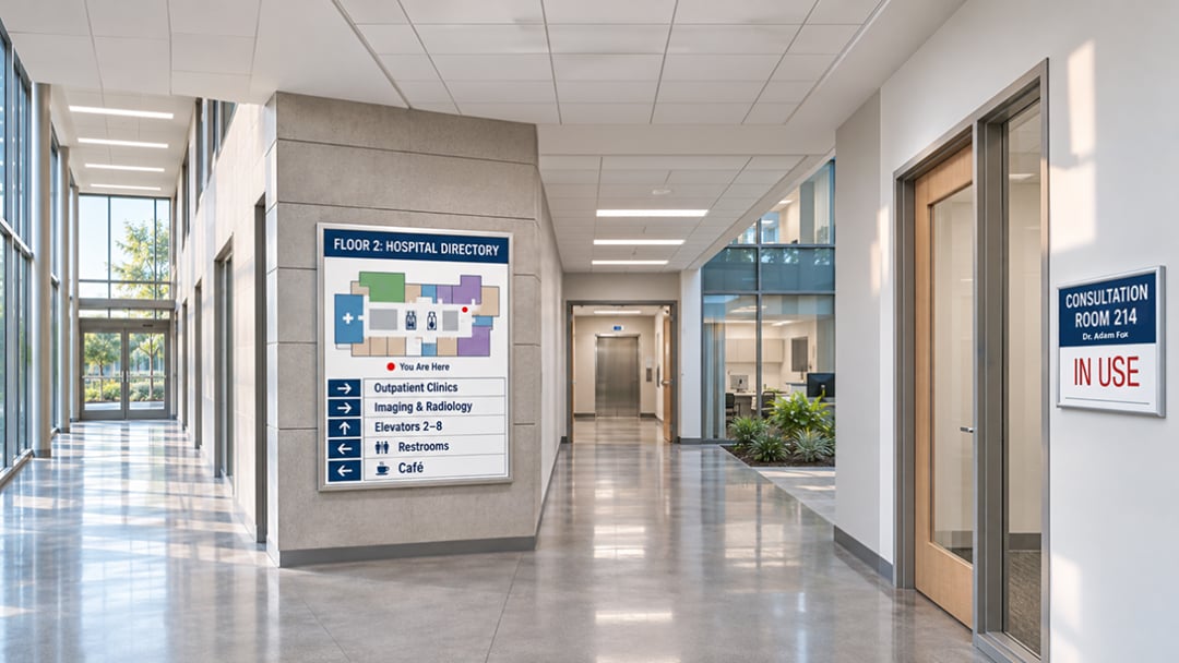
Examples of Wayfinding Signs
Wayfinding systems typically include a mix of sign types, such as:
- Building directories
- Floor directories
- Directional arrows
- Maps ("You Are Here" maps)
- Corridor signs
- Parking signs
- Room identification signs
Where Is Wayfinding Signage Used?
Wayfinding signage is most valuable in places where people are likely to be unfamiliar with the layout, including:
- Hospitals
- Airports
- Universities
- Hotels
- Shopping malls
- Corporate offices
- Government buildings
- Transportation facilities
- Large commercial developments
What Is Directional Signage?
Directional signs do a more specific job: to tell people where to go. When wayfinding is the big picture, directional signage is the individual instructions along the way. They usually contain an arrow and a destination name and are placed at points where people need to make choices.
Purpose of Directional Signage
Directional signs are designed to:
- Point visitors toward destinations
- Indicate routes
- Reduce uncertainty at decision points such as intersections, corridors, and entrances
- Guide both pedestrian and vehicle traffic
Examples of Directional Signs
You've seen these countless times:
- "Reception →"
- "Parking ←"
- "Restrooms →"
- "Emergency Exit ←"
- "Conference Rooms →"
- "Building B →"

Where Is Directional Signage Used?
Directional signs are essential in nearly any space where people need to move from one point to another, including:
- Office buildings
- Hospitals
- Retail spaces
- Campuses
- Hotels
- Parking facilities
- Public spaces
What Is Informational Signage?
Informational signage communicates information rather than primarily directing movement. These signs explain, notify, or remind. They tell visitors what a space is, what's available, or what's expected of them while they're there.
Purpose of Informational Signage
Informational signs exist to:
- Explain services, features, or procedures
- Notify people of rules, hours, or conditions
- Educate visitors about a place or process
- Keep visitors informed about facilities, policies, and changes
Examples of Informational Signs
Common informational signs include:
- "Wi-Fi Available"
- "Please Keep Door Closed"
- "Hours of Operation"
- "No Smoking"
- "Customer Service"
- "Accessible Entrance"
- Building policies and notices

Where Is Informational Signage Used?
Because every business and facility has something to communicate, informational signage appears almost everywhere:
- Retail stores
- Offices
- Hotels
- Hospitals
- Educational institutions
- Public facilities
- Restaurants
- Commercial buildings
Wayfinding vs. Directional vs. Informational Signage
The easiest way to understand the differences is to look at what each type of sign is trying to accomplish for the visitor.
|
Signage Type |
Main Purpose |
Typical Examples |
Primary User Need |
|
Wayfinding |
Help people navigate a space |
Maps, directories, directional systems |
"How do I get there?" |
|
Directional |
Point people toward a destination |
Arrows, corridor signs |
"Which way should I go?" |
|
Informational |
Provide useful information |
Rules, hours, facility information |
"What do I need to know?" |
The relationship between these types matters. Directional signage is usually one component of a larger wayfinding system, while informational signage serves a different communication purpose: it supports the visitor experience but doesn't primarily guide movement.
Key Differences Between Wayfinding and Directional Signage
If you're searching for the difference between wayfinding and directional signage, it comes down to scope and function.
Scope
Wayfinding is an overall navigation strategy. It considers the entire visitor journey, from parking lot to front desk to final destination. Directional signage is an individual sign or sign type used to direct movement within that strategy.
Function
Wayfinding helps users understand where they are, where they need to go, and how to get there. Directional signage has a narrower job: it primarily answers the question, "Which way?"
Examples
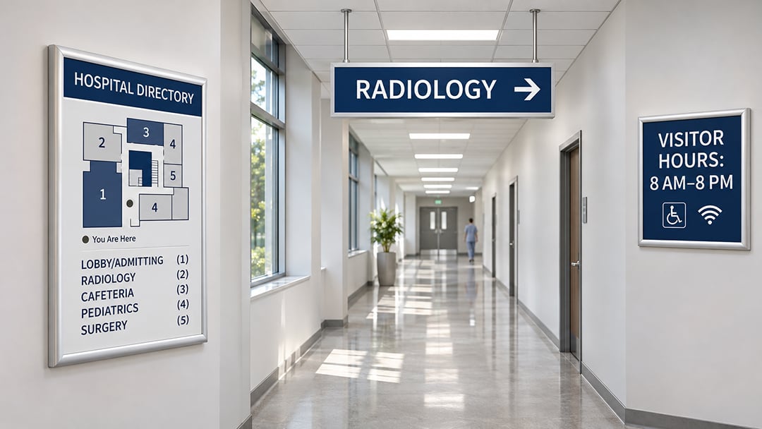
Consider a hospital:
- A building map at the main entrance = wayfinding
- "Radiology →" on a corridor wall = directional
- "Visitor Hours: 8 AM–8 PM" at the front desk = informational
All three help visitors, but each does it differently.
Key Differences Between Directional and Informational Signage
Both directional and informational signs communicate important information, but their objectives differ.
Directional signage says: "Go this way."
Informational signage says: "Here is something you need to know."
For example, "Restrooms →" tells you where to walk. "Restrooms Are for Customers Only" tells you a rule. A sign reading "Parking Garage ↑" directs a driver, while "Garage Closes at 10 PM" informs them. Sometimes a single sign does both, but one purpose usually leads.
How the Three Types of Signage Work Together
These categories aren't isolated. The best signage programs layer all three so visitors get the right message at the right moment.
Example: Hospital
- Wayfinding: A map in the lobby shows departments and floors.
- Directional: "Emergency Department →" guides visitors down the correct hallway.
- Informational: "Emergency Department — Check-in Required" tells them what to do when they arrive.
With the map, a visitor understands the layout. With the arrows, they stay on course. With the informational sign, they know what happens next. Take any one of them away and the experience gets harder. Combined, they create a smooth, low-stress journey.
Why Effective Signage Matters
Good signage is easy to overlook precisely because it works. Bad signage, on the other hand, is impossible to ignore. Here's what effective signage delivers.
1. Improves Visitor Experience
Visitors can move through a space with less stress, which creates a better first impression and a more positive overall experience.
2. Reduces Confusion
Clear signs reduce the number of people who get lost or need to stop and ask for help.
3. Improves Accessibility
Well-designed signage supports people with different mobility, vision, and cognitive needs, helping everyone use a space with more independence.
4. Strengthens Brand Experience
Signage can reinforce your visual identity through colour, typography, and materials, all while remaining functional.
5. Improves Operational Efficiency
When signs do the work, employees spend less time giving directions, and visitors move through your facility more efficiently.
Essential Elements of Effective Wayfinding Signage
Whether you're designing a new system or upgrading an existing one, these fundamentals make the difference.
1. Clear Typography
Choose readable fonts and appropriate text sizes for the viewing distance. Overly stylized typefaces may look appealing but can be hard to read at a glance.
2. High Contrast
Ensure text and symbols stand out clearly from the background. Strong contrast improves legibility in varied lighting and for people with low vision.
3. Consistent Design
Use consistent colors, fonts, icons, and terminology throughout. If one sign says "Lobby" and another says "Main Entrance" for the same place, visitors will wonder if they're different locations.
4. Simple Language
Keep messages short and direct. Avoid unnecessary words and complicated instructions. People read signs while walking, often in a hurry.
5. Effective Use of Arrows and Symbols
Use universally recognized symbols where appropriate, such as restroom, elevator, and exit icons. Arrows should be unambiguous and positioned consistently relative to the text.
6. Strategic Sign Placement
Place signs where people need to make navigation decisions: entrances, intersections, elevator lobbies, and corridor junctions. A perfectly designed sign in the wrong spot is a missed opportunity.
7. Accessibility
Design with accessibility in mind from the start. This includes tactile characters and Braille where required, strong contrast, non-glare finishes, appropriate mounting heights, and compliance with applicable standards such as the ADA Standards for signs. Requirements vary by location and sign type, so it's wise to confirm local codes during planning.
Common Wayfinding and Signage Mistakes to Avoid
Even well-intentioned signage can miss the mark. Watch out for these common problems:
- Too much information on one sign. If visitors can't read it in a few seconds, it's too busy.
- Poor contrast. Light gray text on a white background may look sleek but is hard to read.
- Inconsistent terminology. Using different names for the same place creates confusion.
- Confusing arrows. Ambiguous or inconsistent arrow placement sends people the wrong way.
- Signs placed too late. A sign that appears after a turn is no help at all.
- Poor visibility. Signs blocked by furniture, plants, or glare won't be seen.
- Too many different sign styles. A patchwork of designs makes a space feel disorganized.
- Lack of accessibility considerations. Ignoring tactile, contrast, or mounting requirements excludes users and can create compliance problems.
- Inconsistent placement. Visitors learn where to look; changing it from floor to floor breaks that habit.
- Decorative design at the expense of readability. Style should support function, never replace it.
How to Choose the Right Type of Signage
Start by asking one question: What does the visitor need?
- Need to find a destination? Use directional signage.
- Need to understand the layout of a space? Use wayfinding signage.
- Need to communicate information or instructions? Use informational signage.
- Need all three? Develop a coordinated signage system.
In most commercial buildings, the answer is the last one. A coordinated approach ensures every sign works together rather than competing for attention. If you're budgeting for a project, our wayfinding signs pricing guide explains what drives the cost.
Examples of Signage Systems by Industry
Different environments call for different combinations of signage. Here's how the three types play out across common settings. Apartment communities have their own needs too, which we cover in our multifamily housing signage solutions.
Healthcare and Hospitals
Hospitals are among the most complex environments to navigate, and visitors are often stressed. Systems typically include campus and building maps, department directories, room identification signs, and clear emergency directions. For a deeper look, read our guide to designing effective wayfinding systems for hospitals and healthcare facilities.
Corporate Offices
Office signage typically includes reception signs, floor directories, conference room signs, and navigation for employees and visitors alike, all reinforcing the company's brand.
Universities and Schools
Campuses need campus maps, building directories, directional signs between buildings, and accessibility information to help students, staff, and guests find their way.
Hotels
Hotels rely on lobby directories, room directions, amenity signs, and parking and facility information to help guests settle in quickly.
Retail and Shopping Centers
Shopping centers use store directories, parking directions, restroom signs, and promotional information to keep shoppers moving and engaged.
Public and Government Buildings
Public facilities need department directions, accessibility signs, service information, and clearly marked entrances and exits to serve a wide range of visitors.
Final Thoughts
The difference between these three signage types is simple once you see it:
- Wayfinding signage is the broader navigation system.
- Directional signage tells people which way to go.
- Informational signage gives people useful information.
Successful signage isn't simply about putting signs on walls. It requires clear communication, strategic placement, consistency, accessibility, and thoughtful design. When all three types work together, visitors feel confident, your space runs more smoothly, and your brand makes a better impression.
Planning a new signage program or updating an existing one?
A professional signage partner can help you assess your space, define the right mix of signs, and create a system that looks great and works for every visitor.
Request a Quote
